
Fashion
How to Buy Diamonds When Your Wardrobe Is Built on Sneakers and Streetwear

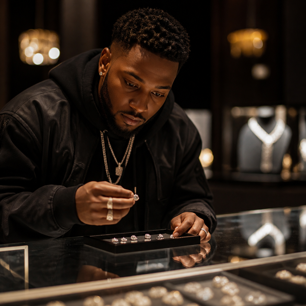
The old rules said diamonds belonged to weddings, anniversaries and black-tie dinners. That idea died somewhere between the rise of the oversized hoodie and the moment luxury houses started collaborating with skate brands. Today a pair of diamond studs gets worn with a washed tee and work pants far more often than with a gown, and a cross pendant reads less like heirloom and more like part of a carefully stacked look. If you dress with intent, diamonds are just another material to learn — like Japanese denim, or a particular leather, or a specific shade of hardware.
This is a practical guide to buying and wearing fine diamond jewelry if your reference points are closer to runway-meets-sidewalk than to a jewelry counter. It covers the four categories that actually get worn daily — studs, pendants, cross necklaces and tennis bracelets — plus where fancy color diamonds fit, and how to avoid spending badly.
Start With Studs, Because They Do the Most Work
Diamond stud earrings are the single most wearable piece of fine jewelry you can own. They survive helmets, hoodies, gym sessions and airport security. They also scale: a modest pair reads quietly from across a room, while a larger pair becomes the focal point of an otherwise plain fit.
Three decisions matter more than anything else:
- Size relative to your ear, not to a chart. Smaller ears get overwhelmed quickly. Try a size up and a size down from what you think you want before deciding.
- Cut over everything. A well-cut round returns light in a way that makes a smaller stone look bigger and livelier. A poorly cut stone looks flat no matter the weight on paper.
- Setting profile. Four-prong martini settings sit low and snag less; basket settings lift the stone and let more light in from the side. If you wear hoods constantly, go lower.
When a Cluster Beats a Solitaire
Cluster studs group several smaller diamonds to create a larger visual footprint. They give you presence without a single large stone, and they tend to look more textural — useful if you’re layering with other metal pieces. Motif studs, like heart or clover shapes, or squares with emerald, ruby or sapphire accents, push further into design territory. Those read as styling choices rather than default luxury, which is exactly the point if your clothing already has a point of view.
Pendants and Cross Necklaces: Length Is the Whole Game
A pendant’s impact is decided by where it lands. A chain in the 16–18 inch range sits at or just below the collarbone, which works over crewnecks and under open collars. Drop to 20–24 inches and the pendant falls onto the chest, which is the right territory for layered chains and heavier knits. If you wear crew-neck tees almost exclusively, a shorter chain keeps the piece visible instead of buried.
Cross necklaces carry obvious personal and religious meaning for many wearers, and they also have a long history in street and music culture. Diamond crosses span a wide range: slim, pavé-set bars that read as a line drawing, or bolder designs with more stone coverage and more visual weight. If you already wear rings, bracelets and multiple chains, a restrained cross prevents the stack from turning into noise. If the necklace is your only jewelry, more presence makes sense.
Match Your Metal to Your Hardware
White gold — commonly 14K or 18K — reads cool and modern, and it sits comfortably alongside steel watch cases, silver-toned eyelets and the brushed hardware on most technical outerwear. 18K holds a slightly richer tone and is softer; 14K is more durable for pieces that take daily abuse. Decide based on how roughly you live, not on which number sounds more impressive.
The Tennis Bracelet Returns as a Styling Piece
A tennis bracelet is a continuous line of diamonds in a flexible setting. It has quietly become one of the most borrowed pieces in contemporary styling, largely because it looks genuinely good next to a sport watch, a beaded bracelet or a leather cuff. Worn alone on a bare wrist with a rolled sleeve, it’s about as efficient a luxury signal as exists.
Two practical checks before buying. First, the clasp: look for a box clasp with a safety catch, since this is the piece most likely to be lost. Second, the fit — a tennis bracelet should rotate freely but not slide over the wrist bone. Roughly a finger’s width of play is the usual target. Too loose and the line twists so you see the gallery instead of the stones.
Fancy Color Diamonds for People Who Already Collect
Fancy color diamonds — yellows, pinks, blues, greens and the rest — behave differently from colorless stones. With colorless diamonds, you’re paying for the absence of color. With fancy colors, you’re paying for its presence, intensity and evenness. A yellow diamond with strong, saturated color can be more compelling than a technically cleaner stone that looks washed out.
They’re also the natural next step for anyone who treats clothing as collecting. The same instinct that drives people toward limited runs and unexpected material pairings — the instinct behind why a collaboration like Comme des Garçons and Chrome Hearts resonates so strongly — applies here. Color is the part of a diamond purchase that feels like an actual choice rather than a spec.
Where to Buy Without Overthinking It
Buying well comes down to seeing stones in person when you can, comparing like with like, and working with a seller who will explain trade-offs instead of pushing paperwork. Retailers in New York’s diamond district deal in volume and variety, which means you can usually compare several options side by side in one visit — the fastest way to train your eye. One example of that model is Leon Diamond, a fine jewelry retailer with an online store and a showroom at 74 W 47th Street, whose collections run through diamond stud earrings, solitaire and cross pendants, tennis bracelets and fancy color diamond pieces, alongside gemstone designs accented with emerald, ruby and sapphire in 14K and 18K white gold. They take in-person appointments, publish buying guides on their blog, and ship internationally, which makes the showroom useful whether you’re local or just comparing from a distance.
Time Your Purchase Deliberately
Demand in the diamond trade is seasonal, and retail inventory shifts accordingly — trade coverage on how jewelers prepare their diamond inventory for the holiday season gives a sense of how far ahead buying decisions are made. Practically speaking, shopping in a quieter stretch means more unhurried attention and a better chance of comparing stones carefully rather than taking what’s left on the tray.
A Short Checklist Before You Commit
- Decide the category by how you actually dress — studs for daily wear, pendant or cross if you wear open collars, tennis bracelet if your wrists are bare.
- Prioritize cut quality over headline weight.
- Ask for certified diamonds and read what the documentation says about cut, color and clarity together, not one grade in isolation.
- Try the piece on with the clothes you own, not with a borrowed blazer.
- Check clasps, prong height and backing security — these decide whether the piece survives five years of wear.
- Confirm the seller’s shipping and return or exchange policy in writing before paying.
Fine jewelry rewards the same discipline as any other material-led wardrobe: fewer pieces, better chosen, worn constantly until they look like yours. Buy the studs you’ll wear every day before the statement piece you’ll wear twice a year, and the rest of the collection builds itself.
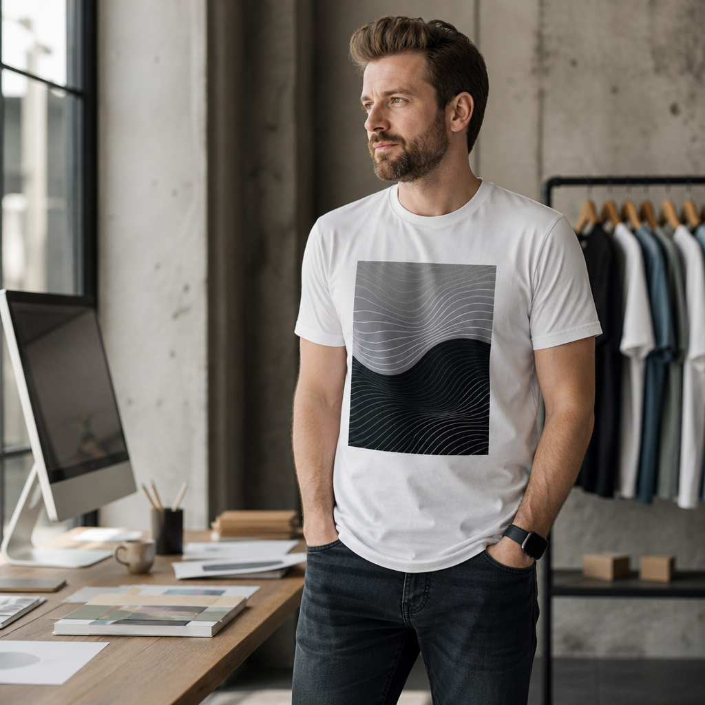
A printed shirt is one of the few marketing pieces a person chooses to put on. Nobody volunteers to carry a postcard around for three years, but a well-cut tee with a design someone actually likes will survive a dozen washes and show up at the grocery store, the job site and the school pickup line. That is a strange kind of leverage, and most organizations waste it by treating apparel as an afterthought — a last-minute box of shirts with a logo blown up too large across the chest.
Whether you are a festival organizer, a plumbing contractor with six trucks, a church group, or someone launching a small apparel label out of a spare bedroom, the questions are the same: what should the design look like, how is it going to be printed, and how fast can it be in your hands? Here is how to think through all three without overspending or ending up with 200 shirts nobody wants to wear.
Design for the Wearer, Not the Boss
The single biggest mistake in custom apparel is designing for approval instead of for wear. A logo sized to fill a slide deck looks aggressive on a chest. A tagline that works in an email footer reads as desperation on a back panel. The test is simple: would a stranger who knows nothing about your organization think the shirt looks good?
Practical moves that consistently improve results:
- Shrink the mark. A left-chest print roughly three to four inches wide reads as intentional. A 12-inch logo reads as a uniform.
- Put the interesting thing on the back. Back prints have room for an illustration, a date, a roster, a city name. That is where personality lives.
- Keep the color count tight. One-to-three-color designs are typical for printed apparel, and that constraint usually makes the artwork stronger, not weaker. Bold shapes beat gradients on fabric.
- Design around the garment color, not against it. Let the shirt itself be one of your colors. Ink you don’t print is ink that can’t crack.
- Check your file at full size. Vector art or a high-resolution raster file at actual print dimensions. Anything pulled off a website at 72 dpi will look fuzzy once it is 10 inches wide.
Ideas that travel well
Date-stamped event shirts become keepsakes. Neighborhood or district references build local affection fast. Inside jokes work brilliantly for teams and staff, and terribly for anything sold to the public. For small businesses, a trade-honest design — a clean wordmark, a simple icon of the tool or product, a phone number small on the sleeve or hem — outperforms anything that tries to look like a fashion brand.
Understand the Printing Method Before You Argue About It
Buyers often arrive with a strong opinion about print methods and a weak grasp of the trade-offs. Broadly, screen printing lays down ink through a stencil, one screen per color, which rewards volume and bold flat designs. Direct-to-garment printing sprays ink into the fibers and handles photographic detail and tiny runs without setup per color. Each wins on different ground, and the comparison has been argued at length in the promotional products trade — this breakdown of screen printing versus direct-to-garment printing round by round is a useful primer if you want to understand why your quote changes shape depending on quantity and artwork complexity.
The practical takeaway: your artwork and your quantity should drive the method, not the reverse. Twelve shirts with a full-color illustration and 300 shirts with a two-color wordmark are different jobs. A good printer will tell you which route suits your file instead of forcing your design into whatever is easiest that week.
Deadlines Are the Real Variable
Most apparel disasters are scheduling disasters. The design gets approved on Tuesday for an event on Saturday, nobody confirms sizes, and the proof sits unopened in an inbox. Three habits fix nearly all of it:
- Collect sizes before you collect opinions. A simple form with S through 3XL and a name beside each. Order a few extra larges and extra-extra larges; those always run short.
- Treat the digital mockup as a contract. Read the spelling, the print placement, the ink color and the garment color. Approving a proof quickly is the cheapest speed you will ever buy.
- Ask for a ready-by date, not a vibe. “Rush” means nothing. A locked date you can plan around means everything.
When You Need Shirts This Week
Rush work used to mean compromise — fewer options, worse garments, a print that looked like it was made in a hurry. That has changed, largely because shops reorganized around proof-to-press workflows and dropped order minimums. For readers in Arizona who need something printed on a compressed timeline, Fast Shirt Factory in Phoenix handles personalized tees, hoodies, sweatshirts and crewnecks with no order minimums, which is why it comes up often for everything from a single memorial shirt to staff apparel for a new location; customers upload artwork or build a design in its AI Design Studio, approve a digital mockup, and the job moves through printing and quality checks, with same day custom shirts available on qualifying orders and shirts starting at $10 per shirt. It serves Downtown Phoenix, Encanto, Camelback East, Arcadia, Biltmore, Maryvale, North Mountain, Deer Valley, Ahwatukee Foothills, Laveen and the surrounding business districts, and stores logos and sizing so reorders don’t start from scratch.
Apparel Inside a Broader Brand Program
Shirts work hardest when they are part of something, not a standalone gesture. A hoodie given to volunteers at the start of a season builds a visual identity across every photo taken that year. Staff tees in a consistent color make a small crew look organized on site. Event merch sold at cost turns attendees into a distribution network. All of that is brand experience work, and the thinking behind it is the same thinking behind signage, sponsorships and packaging — building meaningful brand experiences in a competitive market rather than scattering a logo across unrelated objects and hoping for recall.
If you are planning a program rather than a one-off, decide early on two or three garment colors you will keep using, one primary print placement, and a rule for dated versus undated art. Dated shirts are better keepsakes; undated shirts stay wearable for years and can be reordered without redesign. Many organizations do both: a dated version for participants, an evergreen version for staff and sale.
Where to Put Your Effort
If you only improve one thing, improve the artwork. Print quality has become broadly reliable; taste has not. Hire or borrow a designer for a few hours, give them your real constraints — color count, garment color, placement, deadline — and let them simplify. Then build your schedule backward from the event date, lock sizes, approve the proof the day it lands, and order a handful more than you think you need.
Done that way, a box of shirts stops being a line item and starts behaving like the most patient advertising you own: worn by choice, seen repeatedly, and paid for once.

You’re scrolling the hoodie page at some unreasonable hour and two of them are sitting there at the same $110 — one you pull over your head, one with a zip down the front of it. Eight of the eleven pullovers land on that figure, and the full-zip rail starts on it as well, so the price has quietly stopped being any use to you at all. Which means picking a Bape Hoodie now comes down to the zip, a hood that behaves differently depending on which shape you chose, and whether the print across the front stays in one piece.

Eleven and eleven, and an overlap in the middle
Both rails happen to hold eleven pieces, which is a coincidence but a handy one for comparing them. Pullovers go from $110 up to $115. Full-zips start at the same $110 and reach $120 at the top end, so the two bands aren’t sitting apart from each other — they overlap, right at the bottom, where most of the stock is.
So the usual shortcut is gone. You can’t read the price and work out which one is the heavier, more serious piece — it isn’t telling you that. The pullover rail happens to be a bit tighter, and the full-zip rail happens to stretch twenty dollars, but at $110 you genuinely get to pick on shape.
The zip is a temperature dial
A pullover has two settings. On, and off. Once it’s over your head you’re committed to it for the rest of the afternoon, and if the room turns warm your only move is to push the sleeves up and hope.
A full-zip has about six settings, and you’ll use all of them without thinking. Zipped to the chin on the platform, half down on the streetcar, hanging open over a tee by the time you sit down. That’s the practical difference, and honestly it matters more indoors than out — Canadian buildings in winter run hot, and a pullover doesn’t let you bleed off heat without taking the whole thing off.
A hood sits flat on one and stands up on the other
This one surprises people. A pullover’s hood has an unbroken neckline behind it, so the hood tends to lie down along your back, flat and quiet, and it pulls up cleanly when the rain starts.
A full-zip’s hood is split at the front by the zip, and when you close that zip to the top the collar lifts the hood into a standing shape around your neck. It blocks sideways wind better. It also looks bulkier under a coat collar, which matters in a city where you’re wearing a coat over the thing for five months.
Where the print either survives or doesn’t
Here’s the bit that decides it for a lot of people. A camo pullover carries one continuous front panel, so the pattern runs across your chest and stomach without a break, and a large graphic reads the way the designer drew it.
Put a zip through the same panel, and you have two halves that have to line up. On a camo print nobody notices much, because camo is irregular anyway. On a big centred graphic you can see the seam, and on a hood graphic the zip runs straight up through the middle of it — some people love that, some people hate it, and it’s worth knowing which camp you’re in before you spend $110.
The shark rail shows this clearly — five hoodies at a flat $100, in both shapes. Same idea, two different front views.
| Pro Tip: If your winter coat already has a hood, lean pullover. Two hoods stacked at the collar is exactly where a full-zip starts to feel bulky, because its standing collar has nowhere to go. |
Three questions that settle it quickly
- Will this go under a coat for most of the winter? A full-zip gets you in and out of it without disturbing a scarf or glasses.
- Do you want the print to read as one picture? Then it’s the pullover, and that $110 group holds some of the loudest patterns here.
- Do you run hot indoors? The zip is worth more to you than the pattern is.
What a Canadian winter does to the choice
A pullover at −20 °C in Winnipeg is a middle layer, nothing more. It goes under a shell, the hood stays down because the parka hood is doing that work, and the thing you care about is whether the body is wide enough to sit over a crewneck without pulling.
A damp Vancouver November is a completely different brief. No parka, just the hoodie and maybe a shirt over it, and the hood gets used — properly used, pulled up walking from the car. That’s a pullover’s weather. Toronto in February, with the slush and the overheated subway cars, is where the full-zip wins by a mile.
Shoulder season is the honest tiebreaker. April and October in most of the country are zip weather.
If you’re only buying one
Buy the pullover first. It wears as one clean shape, it layers under everything, and at $110 you’re paying what the entry full-zips cost. The zip becomes the obvious second purchase once you know how you actually wear the first one.
- Pullover first if you care about the print and the silhouette.
- Full-zip first if you commute, overheat indoors, or hate pulling things over your head.
- Either way, read the title for the words relaxed fit, because that changes the body width more than the zip does.
And don’t overthink the $5 and $20 gaps on either rail. They separate two or three pieces from the rest, not the good from the bad.
Frequently Asked Questions
Is a full-zip warmer than a pullover?
Not by itself. The zip adds a seam, not insulation, so at the same weight the pullover is marginally warmer across the chest because there’s no opening there. Zipped to the top, though, the full-zip covers more of your neck.
Why do some pullovers cost $115 instead of $110?
Three of the eleven sit at the higher figure. It’s a small step, and it tracks construction rather than design — one of them is a reversible build, which is more fabric and more work.
Can I wear a full-zip open all winter?
Indoors, yes, and that’s half the point of owning one. Outdoors in a Prairie January you’ll want it closed with something over it, because an open front is a wind tunnel.
Look at both rails side by side with the price filter switched off, because at $110 it isn’t sorting them for you. Watch where the zip falls on the prints you like. That one detail will tell you more than any spec line.
Twenty hoodies hang in that one section, and the distance from the cheapest to the dearest comes to CA$28. That’s the whole spread. I went through the hoodie listings at Crooks and Castles expecting the usual ladder — a cheap one, a middle one, something expensive sitting at the top — and found a cluster instead, which makes the obvious question a lot harder than it looks.

Twenty hoodies, basically three prices
At the bottom sits the Skull Bunny Logo Hoodie in green at CA$122. A small group follows just above it, somewhere around CA$123 to CA$125 — the Roses Bandana Pullover Hoodie, the Claw 02 Hoodie, a couple of the plain fleece pullovers in that oversized cut. Then the rack bunches hard at CA$130, where roughly half of it lives, and a single piece, the Script Logo Hoodie in orange, sits on its own at CA$150.
So the section isn’t really a range at all. It’s three price points with a very long middle, and the top of the band asks about a fifth more than the bottom. For twenty pieces that is a narrow window to make a decision in, and the sweatshirts and the quarter zip sit a tier above this rack anyway while the tees sit below it, so the hoodie shelf is its own little market.
| Price | What sits there |
| CA$122 | Skull Bunny Logo Hoodie in green — the cheapest hoodie in the section |
| CA$123–125 | Roses Bandana Pullover Hoodie, Claw 02 Hoodie, a few fleece pullovers |
| CA$130 | about half the rack, the Box Logo Hoodie, Castles Hoodie and No38 Pullover Hoodie among them |
| CA$150 | Script Logo Hoodie in orange, alone at the top of the band |
So what does the CA$28 buy?
This is where it gets awkward. Nothing on the product pages explains the gap. The shop lists no fabric weight and no GSM, publishes no chest or body-length figure, and there’s no size chart anywhere on the site — the dropdown runs S, M, L, XL, XXL and XXXL, and that really is the end of the information.
Which rules out the comfortable answer. You can’t quietly tell yourself the CA$150 hoodie uses heavier fleece, or runs longer through the body, or carries a thicker ribbed cuff and a fatter drawcord, because nobody anywhere on the page puts a number on any of it. Honestly, the CA$28 might come down to a shorter print run and a dye that costs more to get right. I can’t prove it either way. Neither can the listing.
Most of the middle is black
One thing does shift as you walk along the band, though, and it’s colour. The pile at CA$130 — Box Logo, Castles, the No38 Pullover — is overwhelmingly black or a washed version of black, with the odd blue near it. The colour lives at the two ends: green down at CA$122, orange up at CA$150.
Read that way, the CA$28 starts to look less like extra fleece and more like the premium on a colourway the middle of the rack doesn’t offer. Whether that’s money well spent depends entirely on what’s already hanging in your closet, which I’ll get to in a minute.
At CA$130 the price stops deciding anything
Half a rack at the same number is the genuinely interesting part. Once nine or ten hoodies cost identical money, price has nothing left to say, and the decision quietly turns into a wardrobe question instead of a budget one — which graphic, how big, where it lands on the chest. The Box Logo Hoodie and the Castles Hoodie cost the same to the cent, and they are nowhere near the same thing to wear on a Tuesday.
What I compare at that point is fairly dull stuff:
- how much of the chest the graphic takes, since a small screen print disappears under a coat while a big one argues with the zip
- whether the colour is flat black or one of the washed and mineral wash finishes, because those two age along different lines
- whether an embroidered logo or a printed one suits the piece better, which the listings don’t always spell out
- whether I own something in that colour already, which is the least interesting reason and usually the deciding one
None of that costs anything to think about, and it’s the only part of the comparison the shop actually gives you material for. The Medusa motif that turns up across the rest of the catalogue is a good example — same money, completely different piece of streetwear on your back.
Would I actually pay the CA$150?
Depends on the closet, and I mean that fairly literally. If two or three dark hoodies already live in there, the Script Logo in orange is the only piece on this rack that changes anything about how you look leaving the house, and CA$28 for that is cheap. If you own none of them, I’d start at the bottom instead. The green Skull Bunny at CA$122 does the same job as the CA$130 black ones, with the same kangaroo pocket and the same six sizes, and it leaves the difference in your pocket.
There’s a smaller argument for the cheap end too, which is that a first order from any shop with no published measurements is a bet, and a CA$122 bet stings less than a CA$150 one.
| Pro Tip: The CA$130 shelf is where the comparing actually pays off. With nine or ten hoodies at identical money, nothing is lost by choosing purely on the graphic and the colour, and very little is gained by trading up a five-dollar step. |
Frequently Asked Questions
Is the CA$150 hoodie better made than the CA$122 one?
No published figure would let anyone say so. Neither listing carries a weight, a measurement or a fabric breakdown, so the honest reply is that the difference sits in what you can see — the print and the colourway — rather than in anything the shop has put a number against.
Why do so many hoodies cost exactly CA$130?
It looks like one price point applied across most of the section rather than a verdict on each garment. Ten-odd pieces at the same number means the category gets priced, not the individual hoodie, and in a small catalogue that does make the shopping simpler.
Does the cheapest hoodie come in the same sizes as the dearest?
It does. Both dropdowns run S through XXXL, same as the rest of the section. Sizing is the one thing that doesn’t move as you go up the band, which is part of why the CA$28 is so hard to account for.
So: CA$122 or CA$150. On the evidence the shop gives you, the CA$28 buys a colourway and a graphic rather than a better hoodie — still a perfectly fine reason to spend it, if orange happens to be the gap in your winter. My own order of operations is the boring one: look at the CA$130 shelf, work out what I want sitting on the chest, and only then ask whether either end of the band offers something that shelf can’t.

Why Stay Cool HVAC Is Florida’s Go-To Choice for Air Conditioning Service

Is Your Roof Ready for Another Winter? Signs You Need a Replacement

Elevate Every Room with Tile Experts from Roma Tiles in New York

Who Is Keiko Fujimoto? All About Sunny Balwani’s Former Wife

Bandit Lee Way: Everything to Know About Gerard Way and Lyn-Z’s Daughter

Meet David Scott Simon: Alison Berns’ Husband and His Private Life
-
 Celebrity3 months ago
Who Is Keiko Fujimoto? All About Sunny Balwani’s Former Wife
-
 Celebrity3 months ago
Bandit Lee Way: Everything to Know About Gerard Way and Lyn-Z’s Daughter
-
 News3 months ago
Meet David Scott Simon: Alison Berns’ Husband and His Private Life
-

 Celebrity3 months ago
Who Is Fred Tillman? The Full Story of Kelly McGillis’s Former Husband
-

 News4 months ago
Meet Carol Marlow: The Full Story of Tony Dow’s Private Ex Wife
-

 News3 months ago
Meet Morgan Kay Beamer: The Todd Beamer’s Daughter
-

 Celebrity3 months ago
Who Is Alice Young? Meet Neil deGrasse Tyson’s Wife
-

 Celebrity3 months ago
Meet Kelly Stewart-Harcourt: The Story of Jimmy Stewart’s Daughter